Web App | Nonprofit | Responsive Design
Enhanced member portal to drive user participation
Overview
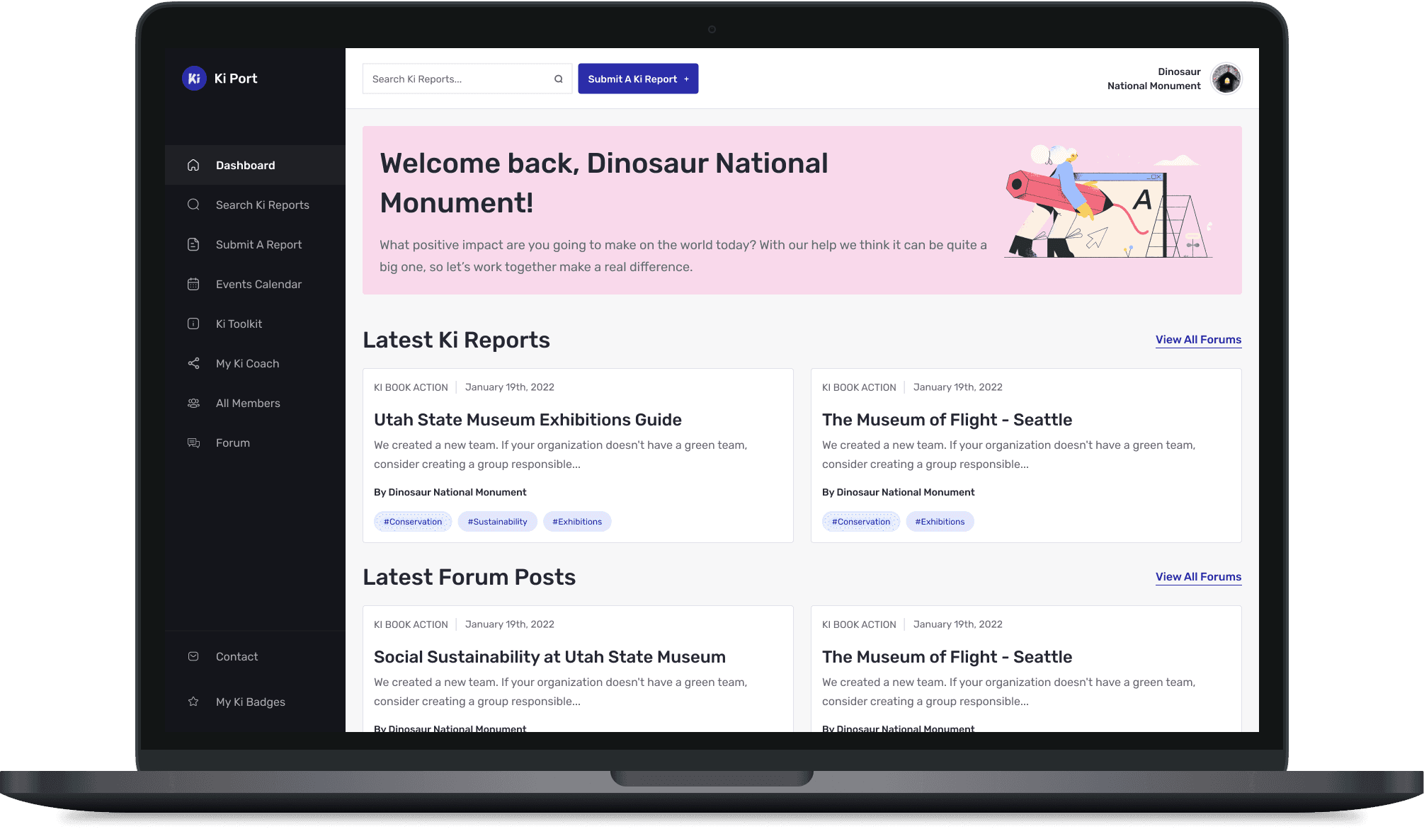
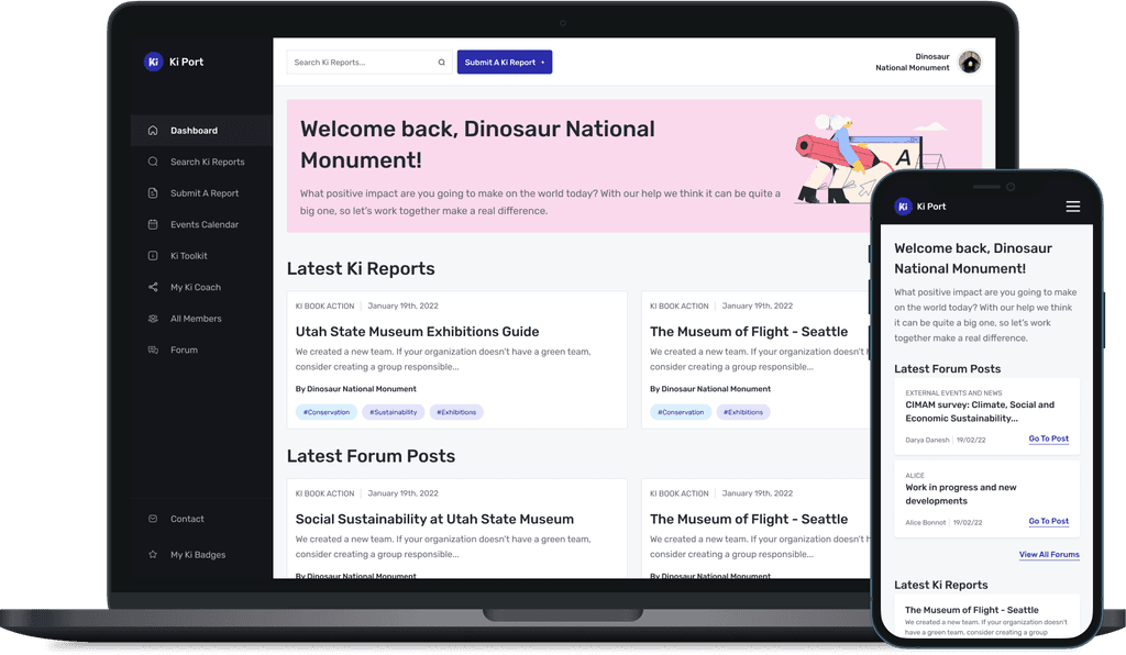
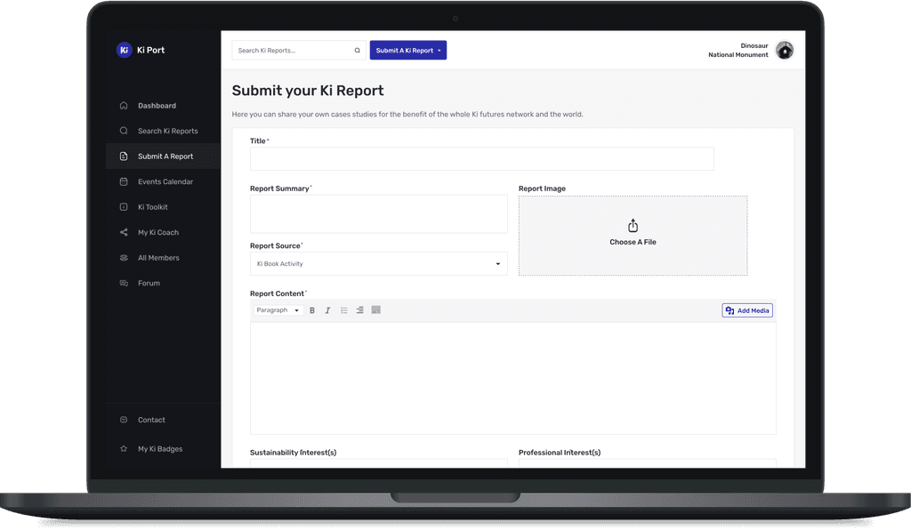
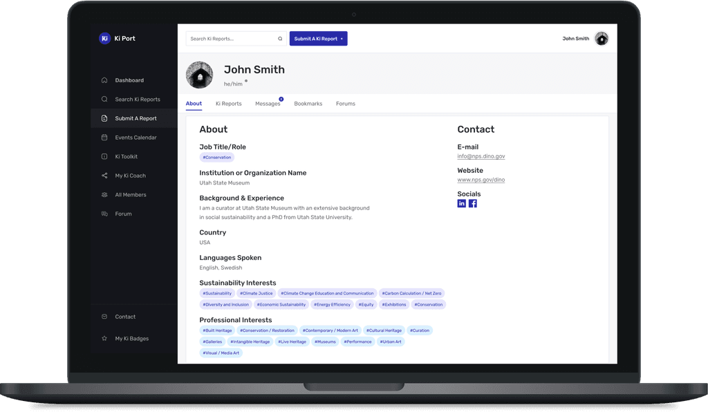
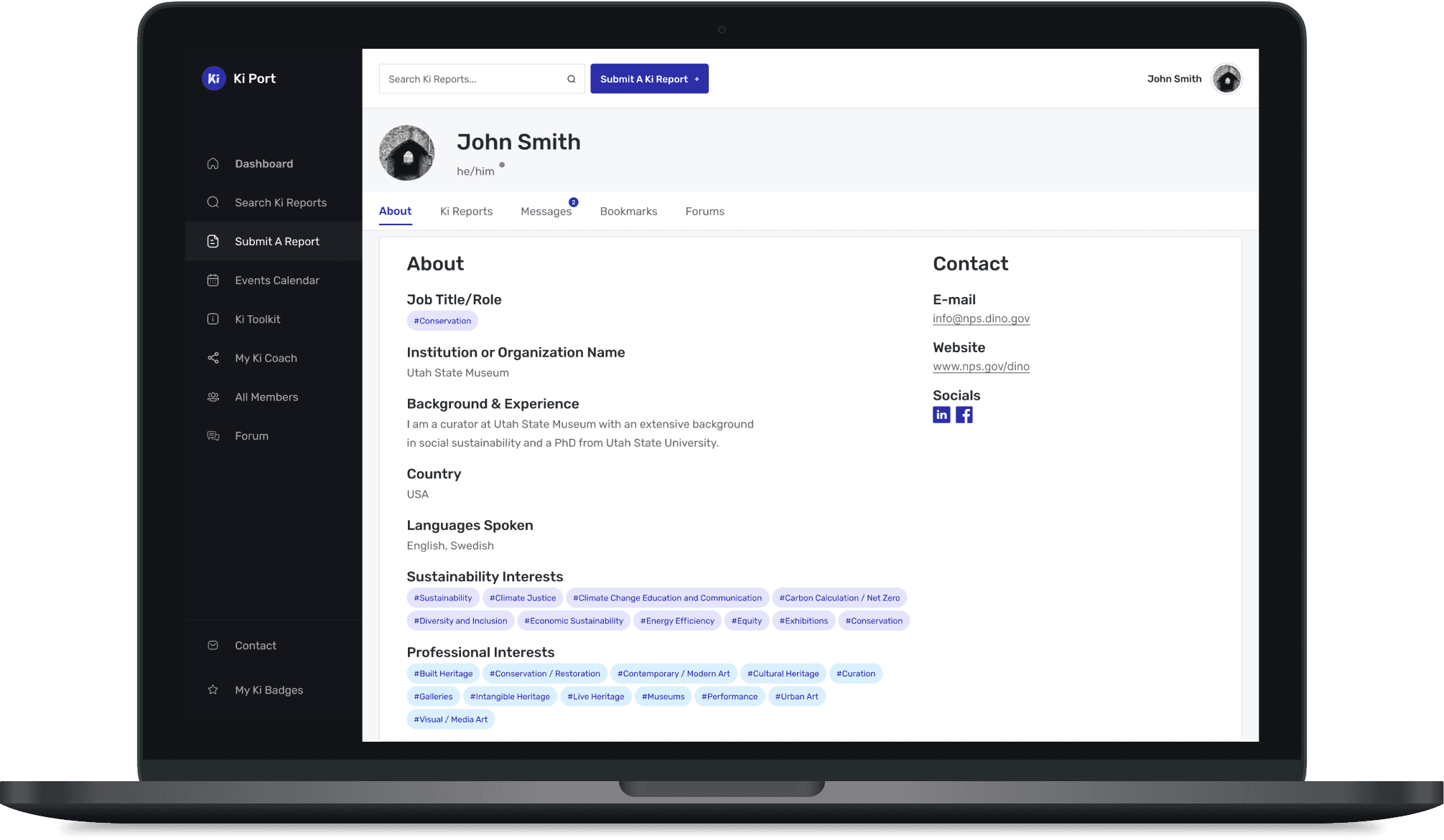
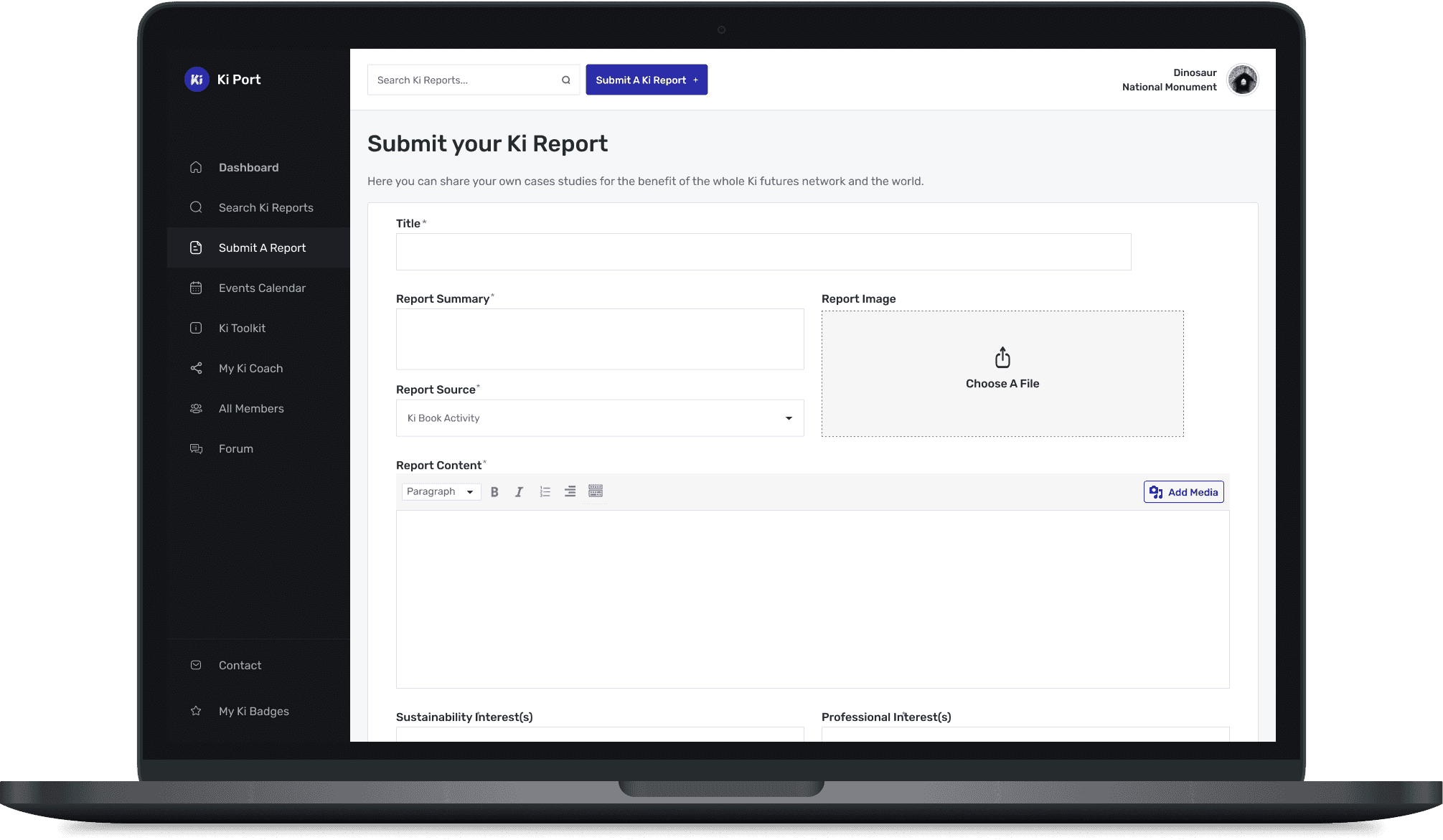
Ki Culture’s member portal supports a global community engaging with sustainability initiatives. However, poor navigation and lack of mobile accessibility limited participation and frustrated users. By redesigning the portal with a focus on usability, accessibility, and mobile responsiveness, we significantly improved content contribution and profile management experiences.
Scope
Role: UX Designer (solo)
Responsibilities: Research, wireframing, mockups, responsive UI design, dev collaboration
Tools: Figma, WordPress CMS constraints, stakeholder interviews
Results
Improved mobile usability and increased access across device types
Reduced navigation friction, supporting more consistent user interaction
Empowered members to contribute and manage content with less frustration
Strengthened alignment between user experience and sustainability goals
Challenge
The original portal made it difficult for members to contribute or manage their content, especially on mobile devices. Disjointed navigation and inconsistent layout created friction that discouraged continued engagement, threatening the growth of Ki Culture’s online community.
Goal
Redesign the portal to streamline user workflows and ensure a responsive, accessible experience across desktop and mobile, within the technical limitations of a WordPress implementation.
Process
Discovery
Conducted stakeholder interviews to understand both organizational goals and user pain points.
Audited the existing portal to identify navigation gaps and layout issues affecting usability.
Design
Created wireframes and mockups addressing content contribution, profile access, and mobile navigation.
Focused on clarity, accessibility, and interaction patterns that worked well across screen sizes.
Prioritized simple, scalable components to align with WordPress limitations.
Collaboration
Worked closely with developers to ensure implementation feasibility, iterating as needed to match design intent.
Maintained regular feedback loops with stakeholders to ensure designs met organizational and user goals.
Solution
The redesigned portal introduced a mobile-first layout with streamlined workflows for submitting content and managing user profiles. Improved navigation and consistent design patterns made the platform easier to use across devices, encouraging greater engagement and participation.
Key takeaways
Even with platform constraints, thoughtful design can meaningfully improve usability and engagement.
Mobile responsiveness and clear navigation are critical for community-based platforms.
Collaborative iteration with stakeholders and developers leads to stronger, more sustainable outcomes.