How AI turned a 60-minute, 660-click process into something users called 'a gift'.
Role
Solo Lead UX Designer
Platform
Android (legacy) · PWA
Timeline
Dec 2024 – Apr 2025
Team
PM, Engineering

The Problem
The right information. The wrong process.
Onboarding a new client meant up to 660 clicks and 60 minutes of manual data entry — every single time. Most of that work wasn't complicated. It was just repetitive, manual, and easy to get wrong.
For the worker
Documenting 30–40 items takes 30 to 60 minutes — around 22 clicks per entry, every time
When an item needs to be recorded in two ways, the system creates two separate entries rather than one combined record — easy to miss, and a source of confusion and extra work
For the Business
Mistakes made during onboarding can't always be corrected right away — they require a separate review process that introduces delays and back-and-forth
The more manual a process is, the more room there is for error — and at this volume, small mistakes add up fast
For the Client
Inaccuracies in this step directly affect the services they receive
Delays from fixing errors mean the right support takes longer to reach them
Design Process
Understanding the system before touching the screens
Understanding the system
Mapped how the legacy app and the new web app needed to work together, and where the handoff between them had to happen
Got clear on exactly what the AI was doing and where the user still needed to make the call — working with engineering early to confirm what was actually buildable
Defining the task flow
Identified which steps depended on each other and mapped how decisions in one step affected the next
Defined what information the user needed at each point to make a confident decision and keep moving
Design and interation
Iterated on the overall flow as a better understanding of user needs and technical constraints emerged
Reworked individual screens based on feedback from the PM, engineering, and SME reviews
Identified and designed for edge cases that weren't visible until deeper into the process
Incorporated UI updates driven by design system changes to keep things consistent across the broader product
Validation
Confirmed the new flow felt faster and easier than what workers were used to
Gathered insights beyond the immediate scope that fed into the broader product roadmap
User reactions included: "It's like I won a prize" and "This is like a gift"
The Solution
From transcription to verification
Instead of typing everything in from scratch, the AI pre-fills a unified list based on existing records. Everything that needs attention is in one place — and the right amount of detail is shown at each step, so the user can move through the flow without getting overwhelmed.
SMart onboarding hub
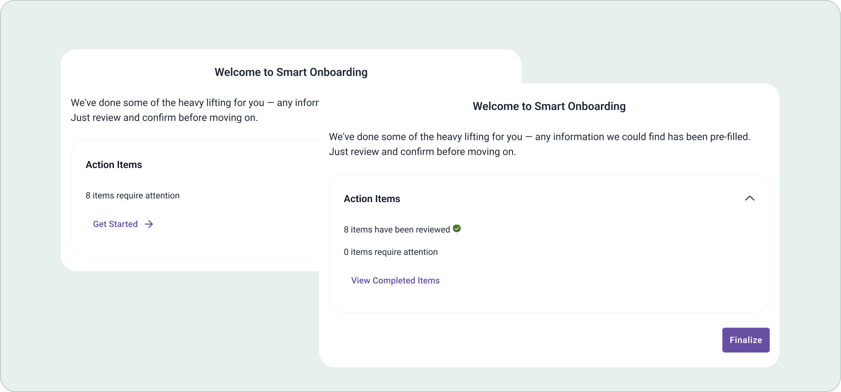
At-a-glance scope. The user can immediately see how many items require their attention — providing visibility into the scope of work before they've even started.
Clear completion state. Once all items have been reviewed, the screen shows completion clearly — so the user knows they're done and can return to their main workflow with confidence.
Frictionless handoff. Once the user has completed their review, a single action returns them to their main workflow — keeping the transition between the two systems as seamless as possible.
Main review screen

1
Bulk select and remove. Easily clear out items that aren't needed before moving to the detailed view — no need to handle them one by one.
2
The right amount of detail. Each item surfaces just enough information for the user to make a confident decision — not every detail, just the right detail. The goal was to avoid an overwhelming wall of data while still giving users what they needed to move forward.
3
Combined entry. When the AI identifies two entries that belong together, they're merged and flagged — reducing clutter and preventing duplicate entries without requiring the user to manually spot and resolve them.
4
AI confidence levels. When the AI isn't sure about a match, it flags the item and lets the user choose what to do right there in the list, no extra screens needed.
Detail view & bulk edit

More detail when you need it. This screen shows the full picture for each item — everything needed to make edits, without cluttering the first review step.
Bulk edit. Select multiple items and update a chosen field across all of them at once — a big time saver when the same change applies to several entries.
Impact
Results that speak for themselves
>600
clicks saved
60 min
saved per onboarding session
"A gift"
user reaction
Why it works
Manual entry meant up to 660 clicks and 60 minutes — the new flow turns that into a quick review-and-confirm
Errors in the old process triggered a whole correction cycle — the new flow reduces mistakes by shifting from manual entry to verification
Problems like duplicate or uncertain entries were invisible before — now they're flagged and resolved right in the list